
 Italiano
 Français
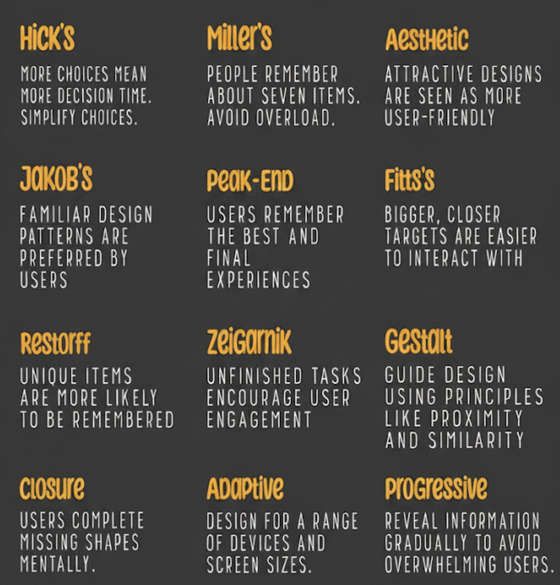
The user experience or user experience (UX) is everything that happens to a person when they interact with a product or service.
In the digital world, this product is typically a website, application or software.
It is not only about the appearance of a product (the user interface), but also about how it works and feels.
Think of it this way:
-
Theuser interface (UI) is the steering wheel, seats and dashboard of a car. It is the part you see and touch.
-
TheUX (User Experience) is the whole act of driving the car: how smooth the ride is, how easy it is to park, how the controls feel and whether you arrive at your destination happy or frustrated.
A good UX is:
-
Useful: It solves a real problem for the user.
-
Usable: It is easy to use and navigate.
-
Desirable: Creates a positive emotional connection.
-
Findable: Users can easily find what they need.
-
Accessible: Can be used by people with disabilities.
-
Credible: Seems reliable and trustworthy.
The ‘Laws of UX’ are a collection of rules, best practices and principles that designers can use to create products that are more intuitive, user-friendly and centred on the human experience.
They are largely based on well-researched psychological principles and are useful for anyone in both digital and physical environments.
Below you will find a comprehensive overview of the most important and most cited laws, categorised for clarity.
Basic Laws (Jakob Nielsen et al.)
These are some of the oldest and most fundamental principles of UX.
-
Jakob’s Law
-
What it is: Users spend most of their time on other websites. Therefore, they prefer your site to function in the same way as all the other sites they are already familiar with.
-
Implications: Don’t reinvent the wheel. Use familiar patterns and conventions (e.g. the shopping cart icon, positioning of the search bar). This reduces the cognitive load and learning curve of the user.
-
-
Fitts’ Law
-
What it is: The acquisition time of a target is a function of the distance and size of the target.
-
Implications: Make interactive elements (such as buttons) large enough and place them in easy-to-reach areas. This is crucial for touch interfaces. This also explains why fixed navigation menus and “Fitts’ law-compatible” angles (where the mouse is stopped by the edge of the screen) are effective.
-
-
Hick’s Law
-
What: The time required to make a decision increases with the number and complexity of choices.
-
Implications: Simplify choices for the user. Break down complex tasks into smaller steps. Use progressive disclosure to avoid overloading users with too many options at once. This is crucial for forms and navigation menus.
-
-
Miller’s Law
-
What: An average person can only store 7 (± 2) items in their working memory.
-
Implications: Break down information into smaller groups of 5-9 items to make it easier to process. This is why telephone numbers are divided into groups and navigation menus are often grouped into categories.
-
-
Postel’s Law (principle of robustness)
-
What it is: Be conservative in sending, liberal in accepting.
-
Implications: Designs should be flexible and lenient. For example, a form field should accept telephone numbers in different formats, or an application should handle user errors gracefully.
-
Laws of perception (Gestalt principles)
These principles describe how human beings visually perceive and group elements.
-
Prägnanz’s Law (Good Figure, Law of Simplicity)
-
What: People perceive and interpret ambiguous or complex images in the simplest possible form.
-
Implications: Users will naturally look for order and simplicity in complex shapes. Use clear and simple icons and avoid unnecessary visual complexity.
-
-
Law of Proximity
-
What it is: Neighbouring objects appear grouped together.
-
Implications: Places related objects close together. It is fundamental for form design (label close to its input) and for tab layout.
-
-
Law of similarity
-
What: Objects that resemble each other are perceived as related or having the same function.
-
Implications: Use consistent styling for elements that perform the same action (e.g. all primary buttons should look the same).
-
-
Law of Closure
-
What: People perceive whole shapes even when they are incomplete.
-
Implications: You can use partial elements (such as a broken circle icon) and the user’s brain will fill in the blanks. This can be used for minimalist and eye-catching design.
-
-
Law of the common region
-
What: Elements that are within the same closed area are perceived as grouped.
-
Implications: Use borders or background colours to group related content, such as tabs or panels in a dashboard.
-
Motivational and behavioural laws
These principles concern user involvement, motivation and emotions.
-
Tesler’s Law (Law of Conservation of Complexity)
-
What it is: Every system has an intrinsic amount of complexity that cannot be reduced. The designer’s task is to manage this complexity, not to eliminate it.
-
Implications: Simplify the user interface by moving complexity behind the scenes. Lets the system do more work so that the user has to do less (e.g. auto-fill modules, intelligent defaults).
-
-
Von Restorff effect (isolation effect)
-
What it is: When several similar objects are present, the one that differs from the others is more likely to be remembered.
-
Implication: Make key actions (such as the ‘Sign Up’ or ‘Buy Now’ button) stand out visually from the other elements on the page.
-
-
Aesthetic-User Effect
-
What: Users often perceive aesthetically pleasing designs as more usable.
-
Implications: A beautiful design can make users more tolerant of minor usability problems and can create a more positive first impression.
-
-
Final peak rule
-
What: People judge an experience by how they felt at its peak (most intense point) and at its end, rather than the total average of each moment.
-
Implications: Pay particular attention to the most impactful moments (a good animation) and the final stage of the user journey (a satisfying confirmation message).
-
-
Doherty Threshold
-
What: Productivity increases when a computer and its users interact at a pace (<400ms) that ensures neither has to wait for the other.
Implication: Provide feedback to the system (such as loading indicators) within 400ms to keep users engaged and informed.
-
How to use these laws
-
As a guide, not as gospel: these are principles, not unbreakable rules. Context is everything. Sometimes breaking a law is the right design decision.
-
As justification: They provide a scientific and psychological basis for your design decisions, helping you to support better UX in discussions with stakeholders.
-
As a checklist: Use them as a mental checklist during the design and critique process. “Am I violating Hick’s law by presenting too many options?”
Why is UX crucial for digital marketing?
Digital marketing is about attracting and converting customers. UX is about what happens after you attract them.
If your UX is poor, your marketing efforts are wasted. They are two sides of the same coin.
Here are some reasons why UX is non-negotiable for marketing success:
1. It has a direct impact on conversion rates (CRO or conversion rate optimisation)
This is the most direct link. Every obstacle a user encounters is an opportunity to abandon it.
-
A confusing payment process = abandoned shopping carts.
-
A page that loads slowly = users hitting the back button.
-
A hard-to-find contact form = lost leads.
Good UX simplifies the user journey from potential customer to customer, eliminating friction and dramatically increasing the chances of conversion.
2. Reduces the cost of customer acquisition (CAC)
Acquiring a new customer through ads or SEO is expensive. Good UX ensures that a higher percentage of these expensive visitors actually convert. You don’t have to spend more to get more leads, you just have to retain more leads that you are already paying to attract.
3. Improve SEO (search engine optimisation)
Google’s main goal is to provide the best possible results to its users (or answers via AI Overviews). How does it measure the validity of a website? Also through so-called UX signals.
-
Core Web Vitals: Metrics such as loading speed, interactivity and visual stability are direct ranking factors.
-
Dwell time/Bounce rate: If users click on your link from Google and leave immediately (high bounce rate), it means that your page was not useful. Good UX keeps them engaged and this indicates to Google that your site is valuable.
-
Mobile-friendliness: With mobile-first indexing, a site that offers a bad experience on a phone will be ranked lower.
4. Builds trust and brand loyalty
A positive and seamless experience makes users feel respected and appreciated. This creates trust in your brand.
-
A user who can easily find information and make a purchase is more likely to return and become a repeat customer.
-
A frustrated user will probably never return and may even leave negative reviews, damaging your brand reputation.
5. Provides valuable data and insights
The UX improvement process (through user testing, heatmaps and analysis) gives marketers incredible insight into the behaviour of their audience.
-
They learn about the content they engage with.
-
You understand where they get stuck in the sales funnel.
-
You understand what their real needs and pain points are.
This data is pure gold for creating more effective and targeted marketing campaigns in the future.
6. Fuel word-of-mouth and social media sharing
People are much more likely to recommend a product or service that was a pleasure to use. A smart, intuitive or frictionless experience is something users will talk about and share, earning you free marketing.
Still not seeing the link between UX and Digital Marketing? Think of the relationship in this way:
-
Digital marketing is the megaphone. It brings people to your digital door.
-
UX is the door, the corridor and the welcome inside. It determines whether people are able to enter, how they feel once inside and whether they decide to stay and buy something.
You can have the best marketing campaign in the world, but if your website is slow, confusing or frustrating, you are essentially spending money to disappoint potential customers.
For further insights – in English – you can visit Yon Jablonsky’s interactive Laws of UX site or the portal of the well-known organisation Nielsen Norman Group NN/g which contains training, case studies and more.